Creating 3D Visualizations with Matplotlib in Python

Introduction
Data visualization has evolved beyond simple 2D plots, and Matplotlib’s powerful 3D capabilities enable us to create compelling visualizations that bring data to life. Whether you’re analyzing scientific data, modeling mathematical functions, or visualizing complex datasets, Matplotlib’s 3D toolkit provides the tools you need to create insightful visualizations.
In this comprehensive guide, you’ll learn how to harness Matplotlib’s 3D visualization capabilities. We’ll explore various types of 3D plots, customization options, and best practices for creating effective visualizations.
This guide is easiest to follow by creating a Jupyter notebook. If you need to setup a Jupyter notebook envrionment check out our guide, Getting Started with Jupyter Notebooks in VS Code.
Setting Up the Environment
Required Libraries and Imports
To get started with 3D visualization in Matplotlib, you’ll need to import the necessary libraries:
import numpy as np
import matplotlib.pyplot as plt
from mpl_toolkits.mplot3d import Axes3D
Backend Considerations
Matplotlib uses backends to render graphics – they determine how plots are displayed and how users interact with them. When creating interactive 3D visualizations, choosing the right backend is crucial:
# In Jupyter notebooks:
%matplotlib notebook  # Classic notebook backend
%matplotlib widget   # Modern interactive backend
%matplotlib qt      # Standalone window backend
Classic Notebook Backend (%matplotlib notebook)
This backend embeds interactive figures directly within Jupyter notebook cells:
- Advantages: Works reliably across environments, requires no additional packages
- Disadvantages: Less responsive for complex 3D plots, older implementation
- Best for: Basic interactivity needs, environments with package restrictions
- Implementation: Uses HTML5 canvas for rendering within the notebook
Widget Backend (%matplotlib widget)
The modern approach for interactive visualization in Jupyter:
- Advantages: Smoother rotation/zoom, better performance with complex 3D plots, more responsive UI
- Disadvantages: Requires installing the
ipymplpackage (pip install ipympl) - Best for: Complex 3D visualizations where performance matters, daily notebook work
- Implementation: Built on ipywidgets framework, uses WebGL for hardware acceleration
Qt Backend (%matplotlib qt)
Opens plots in separate windows outside the notebook:
- Advantages: Highest performance, dedicated window with advanced controls, larger view area
- Disadvantages: Plots appear outside the notebook flow, requires Qt installation
- Best for: Detailed exploration of complex visualizations, presentations, multiple plot comparison
- Implementation: Uses Qt framework, hardware-accelerated rendering
For most 3D visualization work in notebooks, the widget backend (%matplotlib widget) offers the best balance of performance and convenience. For final presentation or detailed exploration, consider switching to the Qt backend.
Choose your backend before creating any plots as changing backends mid-session may require restarting the kernel.
Basic 3D Plot Setup
Creating a 3D Figure and Axes
Creating a 3D plot in Matplotlib is straightforward using the projection='3d' parameter:
import numpy as np
import matplotlib.pyplot as plt

# Create a figure and a 3D axis
fig = plt.figure(figsize=(8, 6))
ax = fig.add_subplot(111, projection='3d')

# Set labels
ax.set_xlabel('X axis')
ax.set_ylabel('Y axis')
ax.set_zlabel('Z axis')
ax.set_title('Simple 3D Axes')

# Draw the plot
plt.show()

Note: While an older method using
Axes3D(fig)exists, it’s now deprecated in newer versions of Matplotlib. Theprojection='3d'approach is recommended for all new code.
Understanding the Coordinate System
The 3D coordinate system in Matplotlib consists of X, Y, and Z axes. The viewing perspective can be adjusted using elevation and azimuth angles:
import numpy as np
import matplotlib.pyplot as plt

# Create a figure and a 3D axis
fig = plt.figure(figsize=(8, 6))
ax = fig.add_subplot(111, projection='3d')

# Set labels
ax.set_xlabel('X axis')
ax.set_ylabel('Y axis')
ax.set_zlabel('Z axis')

# Set axis limits for better visibility
ax.set_xlim(-5, 5)
ax.set_ylim(-5, 5)
ax.set_zlim(-5, 5)

# Set the viewing angle
ax.view_init(elev=20, azim=45)

# Add a title
ax.set_title('3D Coordinate System with Custom View')

plt.show()

The view_init() method controls how you look at the 3D scene:
elev: Elevation angle in degrees (looking up/down)azim: Azimuth angle in degrees (rotating around z-axis)
Adjusting these parameters is essential for highlighting specific features in your 3D data or finding the most informative viewing angle for your visualization.
Types of 3D Plots
Matplotlib offers a variety of 3D plot types, each suited to different visualization needs. Let’s explore each type with executable examples:
Surface Plots
Surface plots excel at visualizing continuous 3D functions and surfaces. They create a solid colored mesh that represents the relationship between three variables, making them ideal for mathematical functions, terrain visualization, and heat maps.
import numpy as np
import matplotlib.pyplot as plt

# Create a figure and a 3D axis
fig = plt.figure(figsize=(10, 8))
ax = fig.add_subplot(111, projection='3d')

# Create data for the surface
x = np.linspace(-5, 5, 100)
y = np.linspace(-5, 5, 100)
X, Y = np.meshgrid(x, y)
Z = np.sin(np.sqrt(X**2 + Y**2))  # A simple radial sine function

# Create the surface plot
surf = ax.plot_surface(X, Y, Z, cmap='viridis', alpha=0.8,
                      linewidth=0, antialiased=True)

# Add customization
ax.set_xlabel('X axis')
ax.set_ylabel('Y axis')
ax.set_zlabel('Z axis')
ax.set_title('3D Surface Plot')

# Add a color bar to show the mapping between colors and Z values
fig.colorbar(surf, ax=ax, shrink=0.5, aspect=5)

plt.show()
In this example, we’re visualizing a radial sine wave where the color gradient indicates the height (Z-value). The cmap parameter controls the color scheme, while alpha sets transparency, and antialiased=True smooths the edges.

Wireframe Plots
Wireframe plots display only the “skeleton” of a surface, using lines to connect points. This allows you to see through the structure, making them useful for examining underlying patterns or when you need to visualize multiple overlapping surfaces.
import numpy as np
import matplotlib.pyplot as plt

# Create a figure and a 3D axis
fig = plt.figure(figsize=(10, 8))
ax = fig.add_subplot(111, projection='3d')

# Create data for the wireframe
x = np.linspace(-5, 5, 50)  # Fewer points for wireframe to avoid overcrowding
y = np.linspace(-5, 5, 50)
X, Y = np.meshgrid(x, y)
Z = np.sin(np.sqrt(X**2 + Y**2))

# Create the wireframe plot
# rstride and cstride control the density of the mesh
wireframe = ax.plot_wireframe(X, Y, Z, rstride=2, cstride=2,
                             color='blue', linewidth=0.5)

# Add customization
ax.set_xlabel('X axis')
ax.set_ylabel('Y axis')
ax.set_zlabel('Z axis')
ax.set_title('3D Wireframe Plot')

plt.show()
The rstride and cstride parameters control how many grid lines to skip in each direction, allowing you to adjust the density of the wireframe. This is important for performance and readability, especially with complex surfaces.

Scatter Plots
3D scatter plots display individual points in three-dimensional space. They’re excellent for visualizing discrete data points, clusters, or point clouds where each point represents an observation with three variables.
import numpy as np
import matplotlib.pyplot as plt

# Create a figure and a 3D axis
fig = plt.figure(figsize=(10, 8))
ax = fig.add_subplot(111, projection='3d')

# Create random data points for scatter plot
n = 150
x = np.random.rand(n) * 10 - 5  # Range from -5 to 5
y = np.random.rand(n) * 10 - 5
z = np.random.rand(n) * 10 - 5
colors = z  # Color points based on z-value

# Create the scatter plot
scatter = ax.scatter(x, y, z, c=colors, cmap='viridis',
                    s=50, alpha=0.8, marker='o')

# Add customization
ax.set_xlabel('X axis')
ax.set_ylabel('Y axis')
ax.set_zlabel('Z axis')
ax.set_title('3D Scatter Plot')

# Add a color bar
fig.colorbar(scatter, ax=ax, shrink=0.5, aspect=5, label='Z value')

plt.show()
This example creates a random point cloud where each point’s color corresponds to its Z-value. The s parameter controls point size, while marker sets the shape. These plots are particularly useful in machine learning for visualizing data in feature space.

Line Plots
3D line plots connect points with lines in three-dimensional space. They’re perfect for visualizing paths, trajectories, time series with three variables, or parametric curves.
import numpy as np
import matplotlib.pyplot as plt

# Create a figure and a 3D axis
fig = plt.figure(figsize=(10, 8))
ax = fig.add_subplot(111, projection='3d')

# Create data for a spiral line
theta = np.linspace(0, 10*np.pi, 1000)
z = np.linspace(0, 10, 1000)
x = np.sin(theta) * (1 + z/10)
y = np.cos(theta) * (1 + z/10)

# Create the 3D line plot
line = ax.plot3D(x, y, z, linewidth=2, color='crimson')

# Add customization
ax.set_xlabel('X axis')
ax.set_ylabel('Y axis')
ax.set_zlabel('Z axis')
ax.set_title('3D Line Plot: Spiral')

# Set a good viewing angle
ax.view_init(elev=35, azim=45)

plt.show()
This example creates an expanding spiral in 3D space using parametric equations. The plot3D method connects the points in the order they’re provided, creating a continuous line that traces the path through space.

Contour Plots
3D contour plots display level sets or isolines of a surface, helping to visualize how values change across a domain. They’re often used alongside surface plots to provide additional context.
import numpy as np
import matplotlib.pyplot as plt

# Create a figure and a 3D axis
fig = plt.figure(figsize=(10, 8))
ax = fig.add_subplot(111, projection='3d')

# Create data for the contour plot
x = np.linspace(-5, 5, 100)
y = np.linspace(-5, 5, 100)
X, Y = np.meshgrid(x, y)
Z = np.sin(np.sqrt(X**2 + Y**2))

# Create contour plot beneath the surface
# The offset parameter places the contour at a specific z value
contour = ax.contour(X, Y, Z, 20, cmap='coolwarm', offset=-1, linewidths=1)

# Add the surface above the contours
surf = ax.plot_surface(X, Y, Z, cmap='viridis', alpha=0.7,
                      linewidth=0, antialiased=True)

# Add customization
ax.set_xlabel('X axis')
ax.set_ylabel('Y axis')
ax.set_zlabel('Z axis')
ax.set_title('3D Surface with Contour Plot')

# Add a color bar
fig.colorbar(surf, ax=ax, shrink=0.5, aspect=5)

# Set z-limits to show contours below the surface
ax.set_zlim(-1.5, 1.5)

plt.show()
This example combines a surface plot with contours projected onto the bottom plane. The offset parameter controls where the contour plot is placed along the z-axis, allowing you to see the relationship between the contours and the surface above them.

Bar Plots
3D bar plots extend traditional bar charts into three dimensions, allowing comparison across two categorical variables. They’re useful for visualizing count data, frequencies, or values across multiple categories and groups.
import numpy as np
import matplotlib.pyplot as plt

# Create a figure and a 3D axis
fig = plt.figure(figsize=(12, 8))
ax = fig.add_subplot(111, projection='3d')

# Create data for the bar plot
x = np.arange(5)  # 5 categories on x-axis
y = np.arange(4)  # 4 groups on y-axis
X, Y = np.meshgrid(x, y)
X = X.flatten()  # Convert to 1D arrays
Y = Y.flatten()
Z = np.zeros_like(X)  # Starting height for bars
height = np.random.rand(len(X)) * 3  # Random bar heights

# Width and depth of bars
dx = 0.5
dy = 0.5

# Create the 3D bar plot
bars = ax.bar3d(X, Y, Z, dx, dy, height, shade=True, color='skyblue',
               edgecolor='gray', alpha=0.8)

# Add customization
ax.set_xlabel('X axis')
ax.set_ylabel('Y axis')
ax.set_zlabel('Value')
ax.set_title('3D Bar Plot')

# Set axis labels to show categories
ax.set_xticks(x + dx/2)
ax.set_yticks(y + dy/2)
ax.set_xticklabels(['Category A', 'Category B', 'Category C', 'Category D', 'Category E'])
ax.set_yticklabels(['Group 1', 'Group 2', 'Group 3', 'Group 4'])

# Set a good viewing angle
ax.view_init(elev=30, azim=45)

plt.tight_layout()
plt.show()
This example creates a grid of 3D bars where each bar’s position represents a combination of two categories, and the height represents a value. The bar3d function requires parameters for the x, y, and z positions, along with width, depth, and height of each bar.

Each of these plot types serves a different purpose in data visualization, and selecting the right type depends on your data structure and the insights you want to communicate. Experiment with different types and combinations to find the most effective visualization for your specific needs.
Customization and Styling
Matplotlib offers extensive options for customizing 3D plots to make them more informative and visually appealing. Let’s explore key customization techniques with complete examples.
Visual Properties
Control the visual appearance of 3D plots with color maps, transparency, and surface properties:
import numpy as np
import matplotlib.pyplot as plt

# Create a figure and a 3D axis
fig = plt.figure(figsize=(10, 8))
ax = fig.add_subplot(111, projection='3d')

# Create data for the surface
x = np.linspace(-5, 5, 100)
y = np.linspace(-5, 5, 100)
X, Y = np.meshgrid(x, y)
Z = np.sin(np.sqrt(X**2 + Y**2))

# Create the surface plot with custom visual properties
surf = ax.plot_surface(X, Y, Z,
                      cmap='viridis',     # Color map (try 'plasma', 'inferno', 'magma', etc.)
                      alpha=0.8,          # Transparency (0 to 1)
                      linewidth=0,        # Width of grid lines (0 for no lines)
                      antialiased=True)   # Smoother edges

# Add a color bar to show Z-value mapping
fig.colorbar(surf, shrink=0.5, aspect=5, label='Height (Z)')

# Add basic labels
ax.set_xlabel('X axis')
ax.set_ylabel('Y axis')
ax.set_zlabel('Z axis')
ax.set_title('Customized Surface Plot')

plt.show()
In this example:
cmapcontrols the color gradient used for the surfacealphaadjusts transparency, useful for visualizing overlapping surfaceslinewidthcontrols the thickness of grid lines (0 hides them)antialiased=Truesmooths the edges for a more polished appearance- The colorbar helps viewers understand the relationship between color and Z-values

Axes and Labels
Customize axes, labels, and tick properties to improve readability and focus attention:
import numpy as np
import matplotlib.pyplot as plt

# Create a figure and a 3D axis
fig = plt.figure(figsize=(10, 8))
ax = fig.add_subplot(111, projection='3d')

# Create data
x = np.linspace(-5, 5, 50)
y = np.linspace(-5, 5, 50)
X, Y = np.meshgrid(x, y)
Z = np.sin(np.sqrt(X**2 + Y**2))

# Create a basic surface plot
surf = ax.plot_surface(X, Y, Z, cmap='coolwarm', alpha=0.7)

# Customize axis limits
ax.set_xlim(-5, 5)
ax.set_ylim(-5, 5)
ax.set_zlim(-2, 2)

# Customize axis labels
ax.set_xlabel('X axis', fontsize=12, labelpad=10, fontweight='bold')
ax.set_ylabel('Y axis', fontsize=12, labelpad=10, fontweight='bold')
ax.set_zlabel('Z axis', fontsize=12, labelpad=10, fontweight='bold')

# Customize title
ax.set_title('Customized Axes and Labels', fontsize=14, pad=20)

# Customize tick parameters
ax.tick_params(axis='x', labelsize=8, pad=5)
ax.tick_params(axis='y', labelsize=8, pad=5)
ax.tick_params(axis='z', labelsize=8, pad=5)

# Add a grid for better spatial reference
ax.grid(True, linestyle='--', alpha=0.6)

plt.show()
This example demonstrates:
- Setting specific axis limits with
set_xlim,set_ylim, andset_zlim - Customizing axis labels with
fontsize,labelpad, andfontweight - Adjusting the title with custom size and padding
- Modifying tick appearance with
tick_params - Adding a grid to help with spatial orientation

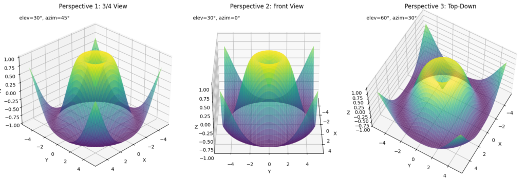
Camera View Control
Control the viewpoint to highlight specific features of your visualization:
import numpy as np
import matplotlib.pyplot as plt

# Create a figure
fig = plt.figure(figsize=(15, 5))

# Create multiple views of the same data
views = [(30, 45), (30, 0), (60, 30)]
titles = ['Perspective 1: 3/4 View', 'Perspective 2: Front View', 'Perspective 3: Top-Down']

# Create data once
x = np.linspace(-5, 5, 50)
y = np.linspace(-5, 5, 50)
X, Y = np.meshgrid(x, y)
Z = np.sin(np.sqrt(X**2 + Y**2))

# Create subplots with different camera angles
for i, (elev, azim) in enumerate(views):
    # Create subplot
    ax = fig.add_subplot(1, 3, i+1, projection='3d')

    # Plot the same surface
    surf = ax.plot_surface(X, Y, Z, cmap='viridis', alpha=0.7)

    # Set the viewing angle
    ax.view_init(elev=elev, azim=azim)

    # Optionally adjust the camera distance
    ax.dist = 8  # Distance from camera to focal point

    # Add labels and title
    ax.set_xlabel('X')
    ax.set_ylabel('Y')
    ax.set_zlabel('Z')
    ax.set_title(titles[i])

    # Add text showing the current view angles
    ax.text2D(0.05, 0.95, f"elev={elev}°, azim={azim}°",
             transform=ax.transAxes, fontsize=10)

plt.tight_layout()
plt.show()
This example shows:
- How to create multiple views of the same data using
view_init(elev, azim) - Using
elev(elevation) to control the vertical viewing angle - Using
azim(azimuth) to rotate around the z-axis - Setting the camera distance with
dist - Adding annotations to indicate the camera position
Combining Customizations
Let’s create a fully customized, publication-quality 3D visualization:
import numpy as np
import matplotlib.pyplot as plt
import matplotlib.cm as cm

# Create a figure with custom size and DPI (dots per inch)
plt.figure(figsize=(12, 9), dpi=100)
ax = plt.subplot(111, projection='3d')

# Create interesting data
x = np.linspace(-4, 4, 50)
y = np.linspace(-4, 4, 50)
X, Y = np.meshgrid(x, y)
R = np.sqrt(X**2 + Y**2)
Z = np.cos(R) * np.exp(-0.2 * R)

# Create a custom colormap
colors = plt.cm.viridis(np.linspace(0, 1, 256))
custom_cmap = cm.colors.LinearSegmentedColormap.from_list('custom_viridis', colors)

# Plot the surface with custom properties
surf = ax.plot_surface(X, Y, Z,
                      cmap=custom_cmap,
                      rstride=1, cstride=1,
                      linewidth=0.1,
                      antialiased=True,
                      alpha=0.9)

# Add contour plot at the bottom for extra context
contour = ax.contour(X, Y, Z, 15, cmap='coolwarm', offset=-0.5, linewidths=2)

# Customize axis appearance
ax.set_xlabel('X axis', fontsize=14, labelpad=15)
ax.set_ylabel('Y axis', fontsize=14, labelpad=15)
ax.set_zlabel('Z axis', fontsize=14, labelpad=15)
ax.set_zlim(-0.5, 1)

# Customize tick appearance
ax.tick_params(axis='both', labelsize=10, pad=8)

# Add a descriptive title
ax.set_title('Damped Cosine Function', fontsize=16, pad=20, fontweight='bold')

# Add a text annotation
ax.text2D(0.02, 0.02, r'$f(x,y) = \cos(\sqrt{x^2+y^2}) \cdot e^{-0.2\sqrt{x^2+y^2}}$',
         transform=ax.transAxes, fontsize=12, bbox=dict(facecolor='white', alpha=0.7))

# Add colorbar with custom properties
cbar = plt.colorbar(surf, shrink=0.6, aspect=20, pad=0.1)
cbar.set_label('Function Value', fontsize=12, labelpad=10)
cbar.ax.tick_params(labelsize=10)

# Set the view angle for best presentation
ax.view_init(elev=35, azim=60)

# Add a grid for better depth perception
ax.grid(True, linestyle='--', alpha=0.6)

# Adjust layout and save/show
plt.tight_layout()
plt.show()
This comprehensive example combines:
- Custom surface plot properties with controlled stride
- Complementary contour plot at the bottom
- Custom colormap and colorbar
- Well-formatted labels, title, and mathematical annotation
- Optimized viewing angle and grid for enhanced depth perception
- Tight layout for proper spacing

Advanced Features
Animation Capabilities
You can create animated 3D visualizations to show your data from different perspectives. Here’s a complete example of how to create a rotating animation:
import numpy as np
import matplotlib.pyplot as plt
from matplotlib.animation import FuncAnimation

# Create a figure and a 3D axis
fig = plt.figure(figsize=(10, 8))
ax = fig.add_subplot(111, projection='3d')

# Create data for the surface
x = np.linspace(-5, 5, 50)
y = np.linspace(-5, 5, 50)
X, Y = np.meshgrid(x, y)
Z = np.sin(np.sqrt(X**2 + Y**2))

# Create the initial surface plot
surf = ax.plot_surface(X, Y, Z, cmap='viridis', alpha=0.8,
                      linewidth=0, antialiased=True)

# Add labels and title
ax.set_xlabel('X axis')
ax.set_ylabel('Y axis')
ax.set_zlabel('Z axis')
ax.set_title('Rotating 3D Surface')

# Function to update the view for each animation frame
def update(frame):
    # Clear the previous plot to prevent memory issues
    ax.clear()

    # Re-create the surface plot
    surf = ax.plot_surface(X, Y, Z, cmap='viridis', alpha=0.8,
                         linewidth=0, antialiased=True)

    # Update the view angle - this is what creates the rotation
    ax.view_init(elev=30, azim=frame)

    # Re-add labels since we cleared the plot
    ax.set_xlabel('X axis')
    ax.set_ylabel('Y axis')
    ax.set_zlabel('Z axis')
    ax.set_title(f'Rotating 3D Surface (Azimuth: {frame}°)')

    return surf

# Create the animation
# frames: specifies the number of frames (rotation angles)
# interval: time between frames in milliseconds
ani = FuncAnimation(fig, update, frames=np.arange(0, 360, 2), interval=50, blit=False)

# To save the animation (requires additional libraries):
# ani.save('rotation.gif', writer='pillow', fps=20)

# Display the animation
plt.tight_layout()
plt.show()
This example demonstrates:
- Creating a basic 3D surface to animate
- Defining an update function that creates a new view for each frame
- Using
view_init()to change the perspective by modifying the azimuth angle - Setting up the animation with FuncAnimation
- Displaying the animation with proper labels and title
- Optional code to save the animation as a GIF
Note: When running this in a Jupyter notebook, the animation will be visible directly. To save animations, you’ll need additional libraries like Pillow for GIF output.

Multiple Subplots
You can create multiple 3D visualizations in the same figure to compare different datasets or different visualization techniques. Here’s a complete example:
import numpy as np
import matplotlib.pyplot as plt

# Create a figure with two subplots side by side
fig = plt.figure(figsize=(15, 6))

# Create data
x = np.linspace(-5, 5, 50)
y = np.linspace(-5, 5, 50)
X, Y = np.meshgrid(x, y)
Z1 = np.sin(np.sqrt(X**2 + Y**2))  # Dataset 1: Sine wave
Z2 = np.cos(np.sqrt(X**2 + Y**2))  # Dataset 2: Cosine wave

# First subplot: Surface plot
ax1 = fig.add_subplot(121, projection='3d')
surf1 = ax1.plot_surface(X, Y, Z1, cmap='viridis', alpha=0.8,
                       linewidth=0, antialiased=True)
ax1.set_title('Surface Plot: Sine Wave')
ax1.set_xlabel('X axis')
ax1.set_ylabel('Y axis')
ax1.set_zlabel('Z axis')
fig.colorbar(surf1, ax=ax1, shrink=0.5, aspect=5)

# Second subplot: Wireframe plot
ax2 = fig.add_subplot(122, projection='3d')
wire2 = ax2.plot_wireframe(X, Y, Z2, cmap='plasma',
                         rstride=2, cstride=2,
                         linewidth=0.5, color='blue')
ax2.set_title('Wireframe Plot: Cosine Wave')
ax2.set_xlabel('X axis')
ax2.set_ylabel('Y axis')
ax2.set_zlabel('Z axis')

# Set the same viewing angle for both plots for easier comparison
ax1.view_init(elev=30, azim=45)
ax2.view_init(elev=30, azim=45)

# Adjust layout and show
plt.tight_layout()
plt.show()
This example demonstrates:
- Creating a figure with multiple 3D subplots
- Displaying different datasets in each subplot
- Using different visualization techniques (surface plot and wireframe)
- Setting consistent viewing angles for easier comparison
- Adding appropriate labels and color scales

Slicing and Cross-Sections
You can visualize cross-sections of 3D data to understand internal structures. Here’s a complete example:
import numpy as np
import matplotlib.pyplot as plt

# Create a figure
fig = plt.figure(figsize=(12, 8))
ax = fig.add_subplot(111, projection='3d')

# Create volumetric data (a 3D gaussian)
x = np.linspace(-3, 3, 30)
y = np.linspace(-3, 3, 30)
z = np.linspace(-3, 3, 30)
X, Y, Z = np.meshgrid(x, y, z)
volume_data = np.exp(-(X**2 + Y**2 + Z**2) / 2)

# Create a slice at x=0 (yz-plane)
x_slice = 15  # Middle slice in the x dimension
x_constant = x[x_slice]
yz_slice = volume_data[x_slice, :, :]

# Create a slice at y=0 (xz-plane)
y_slice = 15  # Middle slice in the y dimension
y_constant = y[y_slice]
xz_slice = volume_data[:, y_slice, :]

# Create a slice at z=0 (xy-plane)
z_slice = 15  # Middle slice in the z dimension
z_constant = z[z_slice]
xy_slice = volume_data[:, :, z_slice]

# Plot the 3D cross-sections
# XY plane (constant z)
X_xy, Y_xy = np.meshgrid(x, y)
ax.plot_surface(X_xy, Y_xy, np.ones_like(X_xy) * z_constant,
               rstride=1, cstride=1, facecolors=plt.cm.viridis(xy_slice),
               alpha=0.8, shade=False)

# XZ plane (constant y)
X_xz, Z_xz = np.meshgrid(x, z)
ax.plot_surface(X_xz, np.ones_like(X_xz) * y_constant, Z_xz,
               rstride=1, cstride=1, facecolors=plt.cm.viridis(xz_slice.T),
               alpha=0.8, shade=False)

# YZ plane (constant x)
Y_yz, Z_yz = np.meshgrid(y, z)
ax.plot_surface(np.ones_like(Y_yz) * x_constant, Y_yz, Z_yz,
               rstride=1, cstride=1, facecolors=plt.cm.viridis(yz_slice.T),
               alpha=0.8, shade=False)

# Customize the plot
ax.set_xlabel('X axis')
ax.set_ylabel('Y axis')
ax.set_zlabel('Z axis')
ax.set_title('3D Cross-sections of a Gaussian Volume')
ax.set_xlim(x.min(), x.max())
ax.set_ylim(y.min(), y.max())
ax.set_zlim(z.min(), z.max())

# Add a colorbar
# First create a ScalarMappable with the colormap
sm = plt.cm.ScalarMappable(cmap=plt.cm.viridis)
sm.set_array(volume_data)
fig.colorbar(sm, ax=ax, shrink=0.5, aspect=5, label='Intensity')

# Set a good viewing angle
ax.view_init(elev=30, azim=45)

plt.tight_layout()
plt.show()
This example demonstrates:
- Creating a 3D volumetric dataset (a Gaussian distribution)
- Extracting 2D cross-sectional slices along each major plane
- Visualizing these cross-sections in 3D space using colored planes
- Properly setting up the color scaling with a colorbar
- Adding appropriate labels and annotations

Interactive Controls with ipywidgets
For Jupyter notebooks, you can add interactive controls to your 3D plots. Here’s a standalone example using ipywidgets:
# This example is meant to be run in a Jupyter notebook with ipywidgets installed
import numpy as np
import matplotlib.pyplot as plt
from ipywidgets import interact, FloatSlider, IntSlider

# First, install required packages if needed:
# !pip install ipywidgets
# !jupyter nbextension enable --py widgetsnbextension
# !jupyter labextension install @jupyter-widgets/jupyterlab-manager

# Create data
x = np.linspace(-5, 5, 50)
y = np.linspace(-5, 5, 50)
X, Y = np.meshgrid(x, y)

# Function to create the plot with given parameters
def plot_3d_surface(frequency=1.0, amplitude=1.0, decay=0.2, cmap_index=0):
    # Create a new figure each time to ensure proper updates
    plt.figure(figsize=(10, 8))
    ax = plt.axes(projection='3d')

    # Calculate Z based on parameters
    R = np.sqrt(X**2 + Y**2)
    Z = amplitude * np.sin(frequency * R) * np.exp(-decay * R)

    # List of color maps to choose from
    cmaps = ['viridis', 'plasma', 'inferno', 'magma', 'cividis',
             'coolwarm', 'rainbow', 'jet', 'terrain']
    cmap = cmaps[cmap_index]

    # Create surface plot
    surf = ax.plot_surface(X, Y, Z, cmap=cmap, linewidth=0, antialiased=True)

    # Add labels and title
    ax.set_xlabel('X axis')
    ax.set_ylabel('Y axis')
    ax.set_zlabel('Z axis')
    ax.set_title(f'Wave function: {amplitude} * sin({frequency} * r) * exp(-{decay} * r)')

    # Set view and limits
    ax.view_init(elev=30, azim=45)
    ax.set_zlim(-amplitude - 0.5, amplitude + 0.5)

    plt.tight_layout()
    plt.show()

# Create interactive widgets
interact(plot_3d_surface,
         frequency=FloatSlider(min=0.1, max=5.0, step=0.1, value=1.0, description='Frequency:'),
         amplitude=FloatSlider(min=0.1, max=2.0, step=0.1, value=1.0, description='Amplitude:'),
         decay=FloatSlider(min=0.0, max=1.0, step=0.05, value=0.2, description='Decay:'),
         cmap_index=IntSlider(min=0, max=8, step=1, value=0, description='Color Map:'))
This example demonstrates:
- Creating an interactive 3D plot with adjustable parameters
- Adding slider controls to modify frequency, amplitude, decay, and color map
- Dynamically generating a new visualization based on user input
- Setting appropriate labels and titles that update with parameter changes

Note on Interactive Widgets:
- This example requires the
ipywidgetspackage - It must be run in a Jupyter notebook environment with widget support enabled
- If the plot doesn’t update as sliders change, try running in JupyterLab or classic Jupyter notebook
- For standalone applications outside of Jupyter, consider using Matplotlib’s built-in widgets:
Performance Tips
3D visualizations can be computationally intensive, especially when rotating or interacting with complex surfaces. Here are some practical techniques to optimize performance:
Reduce Data Density for Smoother Interaction
One of the simplest ways to improve performance is to reduce the number of points in your visualization. This example shows the visual and performance difference between high and reduced-density plots:
import numpy as np
import matplotlib.pyplot as plt
import time

# Create a figure with two subplots side by side
fig = plt.figure(figsize=(16, 7))

# Create original high-density data
x_dense = np.linspace(-5, 5, 100)  # 100 points in each dimension
y_dense = np.linspace(-5, 5, 100)
X_dense, Y_dense = np.meshgrid(x_dense, y_dense)
Z_dense = np.sin(np.sqrt(X_dense**2 + Y_dense**2))

# Create reduced-density data (only use every 4th point)
X_reduced = X_dense[::4, ::4]  # Take every 4th point in both dimensions
Y_reduced = Y_dense[::4, ::4]
Z_reduced = Z_dense[::4, ::4]

# First subplot: High-density plot (10,000 points)
ax1 = fig.add_subplot(121, projection='3d')

# Measure rendering time for high-density plot
start_time = time.time()
surf1 = ax1.plot_surface(X_dense, Y_dense, Z_dense, cmap='viridis',
                       linewidth=0, antialiased=True)
high_density_time = time.time() - start_time

ax1.set_title(f'High Density: 10,000 points\nRender time: {high_density_time:.3f}s', pad=20)
ax1.set_xlabel('X axis')
ax1.set_ylabel('Y axis')
ax1.set_zlabel('Z axis')

# Second subplot: Reduced-density plot (625 points)
ax2 = fig.add_subplot(122, projection='3d')

# Measure rendering time for reduced-density plot
start_time = time.time()
surf2 = ax2.plot_surface(X_reduced, Y_reduced, Z_reduced, cmap='viridis',
                       linewidth=0, antialiased=True)
low_density_time = time.time() - start_time

ax2.set_title(f'Reduced Density: 625 points\nRender time: {low_density_time:.3f}s', pad=20)
ax2.set_xlabel('X axis')
ax2.set_ylabel('Y axis')
ax2.set_zlabel('Z axis')

# Set the same viewing angle for both plots for fair comparison
ax1.view_init(elev=30, azim=45)
ax2.view_init(elev=30, azim=45)

# Add text annotation to highlight performance difference
speedup = high_density_time / low_density_time
fig.text(0.5, 0.01,
        f"Performance impact: Reduced density plot is {speedup:.1f}x faster while preserving key features",
        ha='center', fontsize=12, bbox=dict(facecolor='white', alpha=0.8))

plt.tight_layout()
plt.subplots_adjust(bottom=0.15)  # Make room for the text at the bottom
plt.show()
This example demonstrates:
- High-density plot (left): Uses a 100×100 grid for 10,000 total points, resulting in slower rendering and interaction.
- Reduced-density plot (right): Uses only every 4th point (25×25 grid = 625 points), significantly improving performance while maintaining visual quality.

The key benefits of reducing data density:
- Faster rendering: Initial plotting is much quicker
- Smoother interaction: Rotation, zooming, and panning become more responsive
- Lower memory usage: Important for large datasets or limited hardware
- Similar visual quality: Major features are preserved despite using only ~6% of the original points
For interactive applications, start with a lower-density visualization for smooth exploration, then increase resolution for final rendering if needed.
Common Pitfalls
- Avoid creating too many points in wireframe plots
- Don’t forget to add colorbars for surface plots
- Handle memory management for large datasets
- Test different backends for optimal performance
Real-world Applications
3D visualization techniques can be applied in various domains:
- Scientific Computing: Visualizing molecular structures, electromagnetic fields, or fluid dynamics
- Data Analysis: Displaying clusters in three-dimensional feature space
- Financial Analysis: Plotting surface plots of option pricing models
- Geographic Information Systems: Creating terrain visualizations