Creating Charts and Graphs in JavaScript with React and Recharts
Introduction
In the world of web development, data visualization plays a crucial role in conveying information in a clear and concise manner. Charts and graphs are powerful tools that help users understand complex data sets at a glance. JavaScript, with its versatility and popularity, is often the language of choice for creating interactive and dynamic charts on the web. When combined with React, a popular JavaScript library for building user interfaces, and Recharts, a composable charting library for React, developers have a powerful toolkit at their disposal.
With React and Recharts, creating visually appealing and interactive charts becomes a seamless process. Whether you’re visualizing sales data, tracking user engagement, or displaying trends over time, React and Recharts provide a flexible and customizable solution. By leveraging the component-based architecture of React and the extensive charting capabilities of Recharts, developers can create stunning visualizations that enhance the user experience of their web applications.
In this blog post, we will explore how to harness the power of JavaScript, React, and Recharts to create beautiful and informative charts and graphs. We will walk through the process of setting up a React project, integrating Recharts into our application, and customizing various chart components to suit our needs. By the end of this post, you will have the knowledge and skills to create stunning data visualizations that will impress your users and elevate the overall design of your web applications.
So, let’s dive in and discover the endless possibilities of creating charts and graphs in JavaScript with React and Recharts.
Setting Up Recharts
To get started with creating charts in your React application, you’ll need to set up Recharts. Follow these steps to integrate Recharts into your project:
First, ensure you have a React project set up. If you don’t, you can create one using Create React App:
npx create-react-app my-chart-app
cd my-chart-app
Install Recharts in your project by running the following command in your terminal:
npm install recharts
Once Recharts is installed, you can import the components you need in your React components. For example, to create a line chart, you would import the necessary components like this:
import { LineChart, Line, XAxis, YAxis, CartesianGrid, Tooltip, Legend } from 'recharts';
In your React components, you can now use Recharts to create various types of charts. Here’s a basic example of how to create a simple line chart. Create a file src/SimpleLineChart.js:
import React from 'react';
import { LineChart, Line, XAxis, YAxis, CartesianGrid, Tooltip, Legend } from 'recharts';

const data = [
  { name: 'Page A', uv: 4000, pv: 2400, amt: 2400 },
  { name: 'Page B', uv: 3000, pv: 1398, amt: 2210 },
  { name: 'Page C', uv: 2000, pv: 9800, amt: 2290 },
  { name: 'Page D', uv: 2780, pv: 3908, amt: 2000 },
  { name: 'Page E', uv: 1890, pv: 4800, amt: 2181 },
];

const SimpleLineChart = () => {
  return (
    <LineChart width={600} height={300} data={data}>
      <CartesianGrid strokeDasharray="3 3" />
      <XAxis dataKey="name" />
      <YAxis />
      <Tooltip />
      <Legend />
      <Line type="monotone" dataKey="pv" stroke="#8884d8" />
      <Line type="monotone" dataKey="uv" stroke="#82ca9d" />
    </LineChart>
  );
};

export default SimpleLineChart;
To use this chart in your main App component, you would import it like this:
import React from 'react';
import SimpleLineChart from './SimpleLineChart';
function App() {
return (
<div className="App">
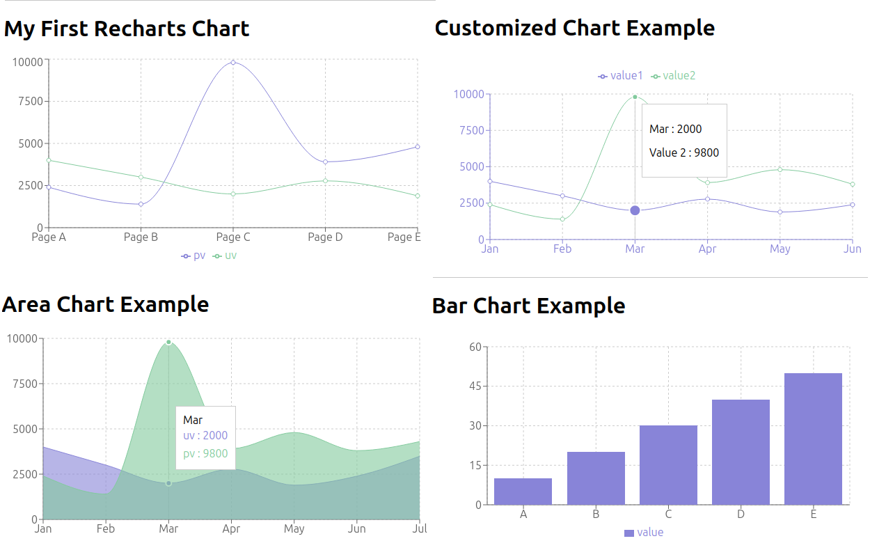
<h1>My First Recharts Chart</h1>
<SimpleLineChart />
</div>
);
}
export default App;
Now run npm start to start the React application. In your browser go to the URL from npm start generally http://localhost:3000/.

With Recharts set up in your project, you’re now ready to start creating more complex and customized charts. In the following sections, we’ll explore how to create different types of charts and how to customize them to fit your needs.
Creating a Simple Bar Chart

Bar charts are an excellent way to compare data across categories. Let’s create a simple bar chart using Recharts.
In your src folder, create a new file named src/BarChartComponent.js.
Add the following imports at the top of the file:
import React from 'react';
import { BarChart, Bar, XAxis, YAxis, CartesianGrid, Tooltip, Legend, ResponsiveContainer } from 'recharts';
Create the BarChartComponent:
const BarChartComponent = () => {
  const data = [
    { name: 'A', value: 10 },
    { name: 'B', value: 20 },
    { name: 'C', value: 30 },
    { name: 'D', value: 40 },
    { name: 'E', value: 50 },
  ];

  return (
    <ResponsiveContainer width="100%" height={300}>
      <BarChart data={data} margin={{ top: 20, right: 30, left: 20, bottom: 5 }}>
        <CartesianGrid strokeDasharray="3 3" />
        <XAxis dataKey="name" />
        <YAxis />
        <Tooltip />
        <Legend />
        <Bar dataKey="value" fill="#8884d8" />
      </BarChart>
    </ResponsiveContainer>
  );
};

export default BarChartComponent;
This component creates a simple bar chart with one data series. The ResponsiveContainer ensures that the chart is responsive and adjusts to its parent container’s size.
To use this component in your main App.js file, import it and add it to your render method:
import React from 'react';
import BarChartComponent from './BarChartComponent';

function App() {
  return (
    <div className="App">
      <h1>Bar Chart Example</h1>
      <BarChartComponent />
    </div>
  );
}

export default App;
Let’s break down the key parts of the BarChartComponent:
<BarChart data={data}>: This is the main component that creates the bar chart. We pass our data to it.<CartesianGrid strokeDasharray="3 3" />: This creates the background grid lines.<XAxis dataKey="name" />: This creates the X-axis, using the “name” property from our data objects.<YAxis />: This creates the Y-axis.<Tooltip />: This enables tooltips when hovering over bars.<Legend />: This adds a legend to the chart.<Bar dataKey="value" fill="#8884d8" />: This creates the actual bars, using the “value” property from our data objects and filling them with a purple color.
By adjusting these components and their properties, you can customize the appearance and behavior of your bar chart. For example, you could add multiple <Bar> components to compare different data series, or change the fill color to match your application’s color scheme.
Creating an Area Chart

Area charts are great for showing trends over time and comparing multiple data series. Let’s create an area chart using Recharts.
In your src folder, create a new file named src/AreaChartComponent.js.
Add the following imports at the top of the file:
import React from 'react';
import { AreaChart, Area, XAxis, YAxis, CartesianGrid, Tooltip, ResponsiveContainer } from 'recharts';
Create the AreaChartComponent:
const AreaChartComponent = () => {
  const data = [
    { name: 'Jan', uv: 4000, pv: 2400, amt: 2400 },
    { name: 'Feb', uv: 3000, pv: 1398, amt: 2210 },
    { name: 'Mar', uv: 2000, pv: 9800, amt: 2290 },
    { name: 'Apr', uv: 2780, pv: 3908, amt: 2000 },
    { name: 'May', uv: 1890, pv: 4800, amt: 2181 },
    { name: 'Jun', uv: 2390, pv: 3800, amt: 2500 },
    { name: 'Jul', uv: 3490, pv: 4300, amt: 2100 },
  ];

  return (
    <ResponsiveContainer width="100%" height={300}>
      <AreaChart data={data} margin={{ top: 10, right: 30, left: 0, bottom: 0 }}>
        <CartesianGrid strokeDasharray="3 3" />
        <XAxis dataKey="name" />
        <YAxis />
        <Tooltip />
        <Area type="monotone" dataKey="uv" stroke="#8884d8" fill="#8884d8" />
        <Area type="monotone" dataKey="pv" stroke="#82ca9d" fill="#82ca9d" />
      </AreaChart>
    </ResponsiveContainer>
  );
};

export default AreaChartComponent;
This component creates an area chart with two data series, “uv” and “pv”.
To use this component in your main App.js file, import it and add it to your render method:
import React from 'react';
import AreaChartComponent from './AreaChartComponent';

function App() {
  return (
    <div className="App">
      <h1>Area Chart Example</h1>
      <AreaChartComponent />
    </div>
  );
}

export default App;
Let’s break down the key parts of the AreaChartComponent:
<AreaChart data={data}>: This is the main component that creates the area chart. We pass our data to it.<CartesianGrid strokeDasharray="3 3" />: This creates the background grid lines.<XAxis dataKey="name" />: This creates the X-axis, using the “name” property from our data objects.<YAxis />: This creates the Y-axis.<Tooltip />: This enables tooltips when hovering over data points.<Area type="monotone" dataKey="uv" stroke="#8884d8" fill="#8884d8" />: This creates the first area, using the “uv” property from our data objects.<Area type="monotone" dataKey="pv" stroke="#82ca9d" fill="#82ca9d" />: This creates the second area, using the “pv” property.
The type="monotone" prop creates a smooth curve for the areas. The stroke prop sets the color of the line, while fill sets the color of the area beneath the line.
By adjusting these components and their properties, you can customize the appearance of your area chart. For example, you could change the colors, add more data series, or adjust the chart’s dimensions to fit your needs.
The area chart is particularly useful for visualizing cumulative data or showing the relationship between multiple data series over time. In this example, we’re comparing “uv” and “pv” values over several months, which could represent different metrics in a real-world application.
One key advantage of using the ResponsiveContainer is that it allows your chart to adapt to different screen sizes, making it more mobile-friendly and improving the overall user experience across devices.
Customizing Charts

Now that we’ve created basic bar and area charts, let’s explore how to customize charts using Recharts. We’ll create a new component that demonstrates various customization options.
In your src folder, create a new file named src/CustomizedChartComponent.js.
Add the following imports at the top of the file:
import React from 'react';
import { LineChart, Line, XAxis, YAxis, CartesianGrid, Tooltip, Legend, ResponsiveContainer } from 'recharts';
Create the CustomizedChartComponent:
const CustomizedChartComponent = () => {
  const data = [
    { name: 'Jan', value1: 4000, value2: 2400 },
    { name: 'Feb', value1: 3000, value2: 1398 },
    { name: 'Mar', value1: 2000, value2: 9800 },
    { name: 'Apr', value1: 2780, value2: 3908 },
    { name: 'May', value1: 1890, value2: 4800 },
    { name: 'Jun', value1: 2390, value2: 3800 },
  ];

  const CustomTooltip = ({ active, payload, label }) => {
    if (active && payload && payload.length) {
      return (
        <div className="custom-tooltip" style={{ backgroundColor: '#fff', padding: '10px', border: '1px solid #ccc' }}>
          <p className="label">{`${label} : ${payload[0].value}`}</p>
          <p className="intro">{`Value 2 : ${payload[1].value}`}</p>
        </div>
      );
    }
    return null;
  };

  return (
    <ResponsiveContainer width="100%" height={300}>
      <LineChart data={data} margin={{ top: 20, right: 30, left: 20, bottom: 5 }}>
        <CartesianGrid strokeDasharray="3 3" />
        <XAxis dataKey="name" stroke="#8884d8" />
        <YAxis stroke="#8884d8" />
        <Tooltip content={<CustomTooltip />} />
        <Legend verticalAlign="top" height={36} />
        <Line type="monotone" dataKey="value1" stroke="#8884d8" activeDot={{ r: 8 }} />
        <Line type="monotone" dataKey="value2" stroke="#82ca9d" />
      </LineChart>
    </ResponsiveContainer>
  );
};

export default CustomizedChartComponent;
To use this component in your main App.js file, import it and add it to your render method:
import React from 'react';
import CustomizedChartComponent from './CustomizedChartComponent';

function App() {
  return (
    <div className="App">
      <h1>Customized Chart Example</h1>
      <CustomizedChartComponent />
    </div>
  );
}

export default App;
Custom Colors: We’ve set custom colors for the chart elements using the stroke prop:
<XAxis dataKey="name" stroke="#8884d8" />
<YAxis stroke="#8884d8" />
<Line type="monotone" dataKey="value1" stroke="#8884d8" activeDot={{ r: 8 }} />
<Line type="monotone" dataKey="value2" stroke="#82ca9d" />
This gives the X and Y axes a purple color (#8884d8), and sets different colors for each line in the chart.
Custom Tooltip: We’ve created a custom tooltip component to display more detailed information when hovering over data points:
const CustomTooltip = ({ active, payload, label }) => {
  if (active && payload && payload.length) {
    return (
      <div className="custom-tooltip" style={{ backgroundColor: '#fff', padding: '10px', border: '1px solid #ccc' }}>
        <p className="label">{`${label} : ${payload[0].value}`}</p>
        <p className="intro">{`Value 2 : ${payload[1].value}`}</p>
      </div>
    );
  }
  return null;
};

// ...

<Tooltip content={<CustomTooltip />} />
This custom tooltip provides more control over the appearance and content of the tooltip.
Legend Positioning: We’ve positioned the legend at the top of the chart:
<Legend verticalAlign="top" height={36} />
This moves the legend from its default position at the bottom to the top of the chart.
Active Dot Customization: We’ve customized the appearance of the active dot (the dot that appears when hovering over a data point) for the first line:
<Line type="monotone" dataKey="value1" stroke="#8884d8" activeDot={{ r: 8 }} />
The activeDot prop increases the radius of the active dot to 8 pixels, making it more prominent.
Responsive Design: By wrapping our chart in a ResponsiveContainer, we ensure that the chart will resize to fit its container:
<ResponsiveContainer width="100%" height={300}>
  {/* Chart content */}
</ResponsiveContainer>
These are just a few examples of the many customization options available in Recharts. You can further customize your charts by:
- Adjusting the chart margins
- Changing the chart type (e.g., from Line to Area)
- Customizing the CartesianGrid
- Adding reference lines or areas
- Implementing click handlers for interactive charts
Remember to consult the Recharts documentation for a full list of customization options and components available.
By leveraging these customization options, you can create charts that not only display your data effectively but also match your application’s design and provide an enhanced user experience.
Conclusion
In this comprehensive guide, we’ve explored how to create and customize charts using React and Recharts. We’ve covered:
- Setting up Recharts in a React project
- Creating a simple bar chart
- Implementing an area chart
- Customizing charts with various options
By following these examples and understanding the principles behind them, you now have the foundational knowledge to create beautiful, interactive, and informative charts that will enhance your React applications.
Here are some key takeaways:
- Modularity: Recharts follows React’s component-based approach, making it easy to compose complex charts from simple building blocks.
- Flexibility: With Recharts, you have fine-grained control over every aspect of your charts, from colors and styles to custom tooltips and interactive elements.
- Responsiveness: Using the
ResponsiveContainercomponent ensures that your charts look great on all screen sizes. - Customization: Recharts offers extensive customization options, allowing you to tailor your charts to fit your specific needs and design requirements.
- Performance: Recharts is built with performance in mind, making it suitable for rendering large datasets or updating charts in real-time.
As you continue to work with Recharts, here are some advanced topics you might want to explore:
- Animated charts
- Combining different chart types
- Handling real-time data updates
- Implementing zooming and panning functionality
- Creating custom chart components
Remember, effective data visualization is not just about making charts look good—it’s about conveying information clearly and intuitively. Always consider your audience and the story you want to tell with your data when designing your charts.