Creating Charts with Python and Seaborn
Data visualization is a crucial part of understanding and communicating insights from data. Among the many Python libraries available for visualization, Seaborn stands out for its simplicity, flexibility, and ability to create aesthetically pleasing charts with minimal code. In this blog post, we’ll explore how to use Seaborn to create a variety of charts in Jupyter Notebooks, covering everything from basic line and bar charts to scatterplots and candlestick charts. The final notebook is available on GitHub.
Why Use Seaborn for Data Visualization?
Seaborn is built on top of Matplotlib and provides a high-level interface for creating informative and attractive statistical graphics. It supports a wide range of chart types, including scatterplots, bar charts, boxplots, and heatmaps, making it a versatile tool for data visualization. Additionally, Seaborn integrates seamlessly with Pandas, allowing you to work directly with DataFrames for efficient data manipulation and visualization.
Environment Setup
For this tutorial, we’ll be working in a Jupyter Notebook, an interactive environment that makes it easy to experiment with code and visualize results in real time. If you’re new to setting up your environment, check out our installation and setup guide for detailed instructions on installing Seaborn and its dependencies. Paste each code sample into a code cell.
Notebook Setup and Importing Libraries
Before we dive into creating charts, let’s set up our notebook and import the required libraries. Here’s the code snippet to get started:
import numpy as np
import pandas as pd
import matplotlib.pyplot as plt
import seaborn as sns
import math
from numpy.random import normal
from IPython.display import display, clear_output
import ipywidgets as widgets

# Set the aesthetic style of the plots
sns.set_theme(style="whitegrid")
This setup ensures that all our charts have a consistent and visually appealing style. The sns.set_theme() function allows us to customize the overall look of our plots, and we’ll explore more styling options later in this post.
Understanding the Data
To demonstrate the versatility of Seaborn, we’ll use a variety of datasets in this tutorial. Here’s a quick overview of the data we’ll be working with. We’ll show the caluclations for generating the data in the first section we leverage it.
- Mathematical Functions: We’ll generate data for functions like sine, cosine, and tangent to create line charts. These are useful for visualizing trends, periodic data, or mathematical relationships.
- Random Walk Time Series: A simulated random walk dataset will help us create line charts that mimic stock price movements or other time series data.
- Bar Chart Data: We’ll use categorical data to create simple, grouped, stacked, and percentage-stacked bar charts.
- Scatterplot Data: This dataset includes numerical and categorical variables, allowing us to create scatterplots, bubble charts, and scatterplot matrices.
- Boxplot Data: Grouped and subgrouped data will be used to create boxplots and violin plots, ideal for visualizing distributions and comparing groups.
- Candlestick Chart Data: Simulated financial data will be used to create candlestick charts, commonly used in stock market analysis.
Each dataset is generated programmatically, and we’ll explain the code behind it as we go along.
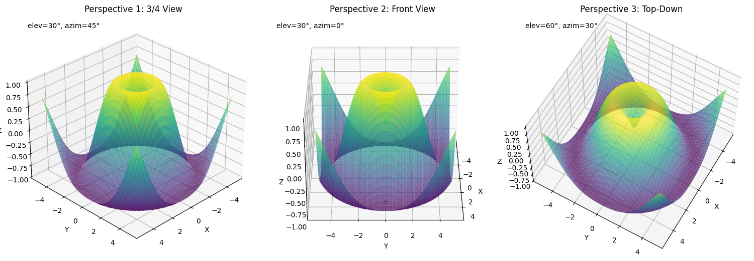
Plotting Mathematical Functions
Let’s start with a simple example: plotting mathematical functions like sine, cosine, and tangent. These functions are often used to visualize periodic trends or relationships in data. Here’s how we can create line charts for these functions:

def plot_math_functions():
    """Create line charts based on mathematical functions."""
    # Generate x values
    x = np.linspace(-2*np.pi, 2*np.pi, 1000)

    # Create a DataFrame with various math functions
    df = pd.DataFrame({
        'x': x,
        'sin(x)': np.sin(x),
        'cos(x)': np.cos(x),
        'tan(x)': np.tan(x),
        'x²': x**2,
        'log(|x|+1)': np.log(np.abs(x) + 1),
        'exp(x/4)': np.exp(x/4)
    })

    # Melt the DataFrame for easier plotting with seaborn
    df_melted = pd.melt(df, id_vars=['x'], var_name='function', value_name='y')

    # Create separate plots for each function to avoid scale issues
    functions = ['sin(x)', 'cos(x)', 'tan(x)', 'x²', 'log(|x|+1)', 'exp(x/4)']

    fig, axes = plt.subplots(3, 2, figsize=(15, 12))
    axes = axes.flatten()

    for i, func in enumerate(functions):
        subset = df_melted[df_melted['function'] == func]

        # For tan(x), limit the y-range to avoid extreme values
        if func == 'tan(x)':
            subset = subset[(subset['y'] > -10) & (subset['y'] < 10)]

        sns.lineplot(x='x', y='y', data=subset, ax=axes[i], linewidth=2.5)
        axes[i].set_title(f'{func}', fontsize=14)
        axes[i].axhline(y=0, color='gray', linestyle='-', alpha=0.3)
        axes[i].axvline(x=0, color='gray', linestyle='-', alpha=0.3)

        # Add pi markers on x-axis
        axes[i].set_xticks([-2*np.pi, -np.pi, 0, np.pi, 2*np.pi])
        axes[i].set_xticklabels(['-2π', '-π', '0', 'π', '2π'])

    plt.tight_layout()
    plt.close()
    return fig
Explanation:
- Data Generation:
We generatexvalues ranging from-2πto2πusingnp.linspace, which creates evenly spaced values over a specified range. For eachxvalue, we calculate mathematical functions like sine, cosine, tangent, square (x²), logarithm (log(|x|+1)), and exponential (exp(x/4)). These functions are chosen to demonstrate a variety of behaviors, such as periodicity and growth. - DataFrame Creation:
The calculated functions are stored in a Pandas DataFrame, where each column represents a function, and thexvalues are stored in a separate column. This tabular structure makes it easy to manipulate and visualize the data.Example of the DataFrame structure:x sin(x) cos(x) tan(x) x² log(|x|+1) exp(x/4) 0 -6.283185 2.449e-16 1.000e+00 2.449e-16 39.4784 1.94591 0.367879 1 -6.270606 -1.256e-02 9.999e-01 -1.257e-02 39.2965 1.94484 0.368351 ... - Melting the Data:
The DataFrame is “melted” usingpd.melt, which transforms it from a wide format (where each function is a separate column) to a long format. In the long format, there are three columns:x: The independent variable.function: The name of the function (e.g.,sin(x),cos(x)).y: The calculated value of the function for eachx.
hueparameter to differentiate between functions when plotting.Example of the melted DataFrame:x function y 0 -6.283185 sin(x) 2.449e-16 1 -6.270606 sin(x) -1.256e-02 ... - Setting Up the Figure and Axes:
To create a grid of charts, we useplt.subplotsto define the figure and axes. Thefigsizeparameter specifies the overall size of the figure, and the3, 2argument creates a grid with 3 rows and 2 columns of subplots. Theaxesobject is a NumPy array that contains individual axes for each subplot.Example:fig, axes = plt.subplots(3, 2, figsize=(15, 12)) axes = axes.flatten()Theaxes.flatten()method converts the 2D array of axes into a 1D array, making it easier to iterate over each subplot. - Plotting Each Function:
We loop through the list of functions (['sin(x)', 'cos(x)', 'tan(x)', 'x²', 'log(|x|+1)', 'exp(x/4)']) and plot each one on a separate subplot. For each function:- We filter the melted DataFrame to get the subset of data corresponding to the current function.
- For
tan(x), we limit the y-range to avoid extreme values caused by vertical asymptotes. - We use
sns.lineplotto plot the function on the corresponding axis.
for i, func in enumerate(functions): subset = df_melted[df_melted['function'] == func] sns.lineplot(x='x', y='y', data=subset, ax=axes[i], linewidth=2.5) - Customizing the Subplots:
- Each subplot is given a title using
axes[i].set_title, which displays the name of the function. - Horizontal and vertical reference lines are added at
y=0andx=0usingaxhlineandaxvlineto make the plots easier to interpret. - The x-axis is customized to display
-2π,-π,0,π, and2πusingset_xticksandset_xticklabels.
axes[i].set_xticks([-2 * np.pi, -np.pi, 0, np.pi, 2 * np.pi]) axes[i].set_xticklabels(['-2π', '-π', '0', 'π', '2π']) - Each subplot is given a title using
- Finalizing the Layout:
Theplt.tight_layout()function adjusts the spacing between subplots to ensure that titles, labels, and plots do not overlap. Finally, the figure is closed withplt.close()to prevent it from being displayed immediately in the notebook.
Random Walk Line Chart
Next, we’ll simulate a random walk, which is a common way to model stock prices or other time series data. A random walk is generated by taking the cumulative sum of random steps. Here’s how we can create and visualize a random walk:

def random_walk(steps=1000, step_size=0.1):
    """Generate a random walk time series."""
    # Generate random steps with normal distribution
    steps = normal(loc=0, scale=step_size, size=steps)

    # Calculate the walk by taking the cumulative sum
    walk = np.cumsum(steps)

    # Create a time index
    time = np.arange(len(walk))

    return pd.DataFrame({'time': time, 'value': walk})

def plot_random_walk():
    """Create a line chart based on a random walk function."""
    # Generate multiple random walks
    walks = []
    for i in range(5):
        df = random_walk(steps=500, step_size=0.1)
        df['series'] = f'Series {i+1}'
        walks.append(df)

    # Combine all walks
    all_walks = pd.concat(walks)

    # Plot the random walks
    fig, ax = plt.subplots(figsize=(12, 6))
    sns.lineplot(x='time', y='value', hue='series', data=all_walks, linewidth=1.5)

    plt.title('Random Walk Time Series Simulation', fontsize=16)
    plt.xlabel('Time', fontsize=12)
    plt.ylabel('Value', fontsize=12)
    plt.grid(True, alpha=0.3)
    plt.legend(title='')

    plt.tight_layout()
    plt.close()
    return fig
Explanation:
- Random Walk Generation:
A random walk is a sequence of steps where each step is determined randomly. This is commonly used to model stock prices, particle movements, or other time series data.- The
random_walkfunction generates a random walk by first creating random steps usingnp.random.normal, which draws samples from a normal distribution. - The cumulative sum of these steps (
np.cumsum) is calculated to simulate the random walk. - A time index is created using
np.arangeto represent the sequence of steps.
time value 0 0 0.012345 1 1 0.034567 2 2 0.056789 ... - The
- Multiple Series:
To make the visualization more interesting, we generate five separate random walks. Each random walk is stored in a DataFrame, and a new columnseriesis added to label the series (e.g.,Series 1,Series 2, etc.).- These individual DataFrames are appended to a list (
walks), and all the walks are combined into a single DataFrame usingpd.concat.
time value series 0 0 0.012345 Series 1 1 1 0.034567 Series 1 2 2 0.056789 Series 1 ... 500 0 -0.023456 Series 2 501 1 0.045678 Series 2 ... - These individual DataFrames are appended to a list (
- Plotting:
The combined DataFrame is passed to Seaborn’ssns.lineplotfunction to plot all random walks on the same chart.- The
hueparameter is used to differentiate between the series, assigning each series a unique color. - The
linewidthparameter is set to1.5. - The chart includes a title, x-axis label (
Time), and y-axis label (Value).
- The
- Customizing the Chart:
- A grid is added to the chart using
plt.gridto make it easier to interpret the fluctuations in the random walks. - The
plt.tight_layout()function ensures that the chart elements (title, labels, legend) do not overlap. - Finally, the figure is closed with
plt.close()to prevent it from being displayed immediately in the notebook.
- A grid is added to the chart using
Bar Charts
Bar charts are a versatile way to visualize categorical data. They can be used to compare values across categories, show proportions, or highlight trends. In this section, we’ll explore different types of bar charts, including simple, grouped, stacked, and percentage-stacked bar charts.
Generating Data for Bar Charts
def create_sample_data():
    """Create sample datasets for bar charts."""
    # Sample data for simple bar chart
    categories = ['Category A', 'Category B', 'Category C', 'Category D', 'Category E']
    values = [25, 40, 30, 55, 15]

    simple_data = pd.DataFrame({
        'Category': categories,
        'Value': values
    })

    # Sample data for grouped and stacked bar charts
    groups = ['Group 1', 'Group 2', 'Group 3', 'Group 4']
    products = ['Product X', 'Product Y', 'Product Z']

    # Create a more complex dataset with multiple variables
    data = []
    np.random.seed(42)  # For reproducibility

    for group in groups:
        for product in products:
            sales = np.random.randint(10, 100)
            profit = np.random.randint(5, 30)
            returns = np.random.randint(1, 10)

            data.append({
                'Group': group,
                'Product': product,
                'Sales': sales,
                'Profit': profit,
                'Returns': returns
            })

    complex_data = pd.DataFrame(data)

    # Sample data for percentage stacked bar chart
    regions = ['North', 'South', 'East', 'West']
    segments = ['Segment A', 'Segment B', 'Segment C']

    pct_data = []
    for region in regions:
        # Ensure percentages will sum to 100
        pcts = np.random.randint(10, 50, size=len(segments))
        pcts = (pcts / pcts.sum() * 100).astype(int)

        # Adjust to ensure sum is 100
        pcts[-1] = 100 - pcts[:-1].sum()

        for i, segment in enumerate(segments):
            pct_data.append({
                'Region': region,
                'Segment': segment,
                'Percentage': pcts[i]
            })

    percentage_data = pd.DataFrame(pct_data)

    return simple_data, complex_data, percentage_data
Explanation of data generation
- Simple Bar Chart Data:
- A list of categories (
Category A,Category B, etc.) and their corresponding values (e.g., 25, 40, etc.) are created. - These are stored in a Pandas DataFrame (
simple_data) for easy plotting.
- A list of categories (
- Grouped and Stacked Bar Chart Data:
- Groups (
Group 1,Group 2, etc.) and products (Product X,Product Y, etc.) are defined. - Random values for sales, profit, and returns are generated using
np.random.randintto simulate a dataset with multiple variables. - These values are stored in a DataFrame (
complex_data).
- Groups (
- Percentage Stacked Bar Chart Data:
- Regions (
North,South, etc.) and segments (Segment A,Segment B, etc.) are defined. - Random percentages are generated for each segment within a region, ensuring they sum to 100.
- These percentages are stored in a DataFrame (
percentage_data).
- Regions (
Code Example: Simple Bar Chart

def plot_simple_bar_chart(data):
    """Create a simple bar chart."""
    fig, ax = plt.subplots(figsize=(10, 6))

    # Create the bar chart - handle both old and new seaborn API
    try:
        # New seaborn API (v0.12+)
        sns.barplot(x='Category', y='Value', data=data, palette='viridis', errorbar=None)
    except TypeError:
        # Old seaborn API
        sns.barplot(x='Category', y='Value', data=data, palette='viridis')

    plt.title('Simple Bar Chart', fontsize=16)
    plt.xlabel('Category', fontsize=12)
    plt.ylabel('Value', fontsize=12)
    plt.grid(axis='y', alpha=0.3)

    # Add value labels on top of bars
    for i, v in enumerate(data['Value']):
        plt.text(i, v + 1, str(v), ha='center', fontsize=10)

    plt.tight_layout()
    plt.close()
    return fig
Explanation of Simple Bar Chart Code:
- Input Data:
- The function takes a DataFrame (
data) with two columns:Category(categorical variable) andValue(numerical variable).
- The function takes a DataFrame (
- Bar Chart Creation:
- The
sns.barplotfunction is used to create the bar chart. - The
xparameter specifies the categorical variable (Category), and theyparameter specifies the numerical variable (Value). - The
paletteparameter is set to'viridis'to apply a visually appealing color scheme. - The
errorbar=Noneargument is included for compatibility with Seaborn v0.12+.
- The
- Backward Compatibility:
- A
try-exceptblock is used to handle differences between Seaborn versions. If theerrorbarparameter is not supported (older versions), the code falls back to the older API.
- A
- Customization:
- A title and axis labels are added using
plt.title,plt.xlabel, andplt.ylabel. - A grid is added along the y-axis using
plt.gridto improve readability.
- A title and axis labels are added using
- Value Labels:
- The
plt.textfunction is used to add value labels on top of each bar, making the chart more informative.
- The
Code Example: Grouped Bar Chart

def plot_grouped_bar_chart(data):
    """Create a grouped bar chart."""
    fig, ax = plt.subplots(figsize=(12, 7))

    # Create the grouped bar chart - handle both old and new seaborn API
    try:
        # New seaborn API (v0.12+)
        sns.barplot(x='Group', y='Sales', hue='Product', data=data, palette='Set2', errorbar=None)
    except TypeError:
        # Old seaborn API
        sns.barplot(x='Group', y='Sales', hue='Product', data=data, palette='Set2')

    plt.title('Grouped Bar Chart - Sales by Group and Product', fontsize=16)
    plt.xlabel('Group', fontsize=12)
    plt.ylabel('Sales', fontsize=12)
    plt.grid(axis='y', alpha=0.3)
    plt.legend(title='Product', loc='upper right')

    plt.tight_layout()
    plt.close()
    return fig
Explanation:
- Input Data:
- The function takes a DataFrame (
data) with columnsGroup,Product, andSales. - Each row represents the sales of a specific product within a group. For example:
Group Product Sales 0 Group 1 Product X 45 1 Group 1 Product Y 30 2 Group 1 Product Z 25 ...
- The function takes a DataFrame (
- Bar Chart Creation:
- The
sns.barplotfunction is used to create the grouped bar chart. - The
xparameter specifies the categorical variable (Group), and theyparameter specifies the numerical variable (Sales). - The
hueparameter is set toProduct, which groups the bars by product within each group. - The
paletteparameter is set to'Set2'to apply a visually distinct color scheme. - The
errorbar=Noneargument is included for compatibility with Seaborn v0.12+.
- The
- Customization:
- A title and axis labels are added using
plt.title,plt.xlabel, andplt.ylabel. - A grid is added along the y-axis using
plt.gridto improve readability. - A legend is added using
plt.legend, with the title set toProductand positioned in the upper-right corner.
- A title and axis labels are added using
Code Example: Stacked Bar Chart
Seaborn does not natively support stacked bar charts, but we can create one using Matplotlib:

def plot_stacked_bar_chart(data):
    """Create a stacked bar chart."""
    # Pivot the data for stacking
    pivot_data = data.pivot_table(
        index='Group',
        columns='Product',
        values='Sales',
        aggfunc='sum'
    )

    # Plot the stacked bar chart
    fig, ax = plt.subplots(figsize=(12, 7))
    pivot_data.plot(kind='bar', stacked=True, figsize=(12, 7), colormap='Set3', ax=ax)

    plt.title('Stacked Bar Chart - Sales by Group and Product', fontsize=16)
    plt.xlabel('Group', fontsize=12)
    plt.ylabel('Sales', fontsize=12)
    plt.grid(axis='y', alpha=0.3)
    plt.legend(title='Product', loc='upper right')

    # Add total labels on top of stacked bars
    for i, total in enumerate(pivot_data.sum(axis=1)):
        plt.text(i, total + 1, f'Total: {total}', ha='center', fontsize=10)

    plt.tight_layout()
    plt.close()
    return fig
Explanation:
- Input Data:
- The function takes a DataFrame (
data) with columnsGroup,Product, andSales. - Each row represents the sales of a specific product within a group. For example:
Group Product Sales 0 Group 1 Product X 45 1 Group 1 Product Y 30 2 Group 1 Product Z 25 ...
- The function takes a DataFrame (
- Pivoting the Data:
- The
pivot_tablefunction is used to reshape the data into a format suitable for a stacked bar chart. - The
indexparameter specifies the grouping variable (Group), thecolumnsparameter specifies the categories to stack (Product), and thevaluesparameter specifies the numerical variable (Sales). - The resulting DataFrame has groups as rows, products as columns, and sales as values.
Product X Product Y Product Z Group 1 45 30 25 Group 2 50 40 35 - The
- Plotting:
- The
plotmethod of the pivoted DataFrame is used to create the stacked bar chart. - The
kind='bar'parameter specifies a bar chart, andstacked=Trueensures that the bars are stacked. - The
colormap='Set3'parameter applies a visually distinct color scheme.
- The
- Customization:
- A title, axis labels, and a legend are added for clarity.
- A grid is added along the y-axis using
plt.gridto improve readability.
- Adding Total Labels:
- The
sum(axis=1)method calculates the total sales for each group. - The
plt.textfunction is used to add total labels on top of each stacked bar, making the chart more informative.
- The
Code Example: Percentage Stacked Bar Chart

def plot_percentage_stacked_bar(data):
    """Create a percentage stacked bar chart."""
    # Pivot the data
    pivot_data = data.pivot_table(
        index='Region',
        columns='Segment',
        values='Percentage',
        aggfunc='sum'
    )

    # Plot the percentage stacked bar chart
    fig, ax = plt.subplots(figsize=(12, 7))
    pivot_data.plot(kind='bar', stacked=True, figsize=(12, 7), colormap='tab10', ax=ax)

    plt.title('Percentage Stacked Bar Chart - Market Segments by Region', fontsize=16)
    plt.xlabel('Region', fontsize=12)
    plt.ylabel('Percentage', fontsize=12)
    plt.grid(axis='y', alpha=0.3)
    plt.legend(title='Segment', loc='upper right')

    # Add percentage labels in the middle of each segment
    for i, (idx, row) in enumerate(pivot_data.iterrows()):
        cumulative = 0
        for col, val in row.items():
            # Position the text in the middle of each segment
            y_pos = cumulative + val/2
            plt.text(i, y_pos, f'{val}%', ha='center', va='center', fontsize=10)
            cumulative += val

    plt.tight_layout()
    plt.close()
    return fig
Explanation:
- Input Data:
- The function takes a DataFrame (
data) with columnsRegion,Segment, andPercentage. - Each row represents the percentage of a specific segment within a region. For example:
Region Segment Percentage 0 North Segment A 40 1 North Segment B 35 2 North Segment C 25 ...
- The function takes a DataFrame (
- Pivoting the Data:
- The
pivot_tablefunction is used to reshape the data into a format suitable for a percentage stacked bar chart. - The
indexparameter specifies the grouping variable (Region), thecolumnsparameter specifies the categories to stack (Segment), and thevaluesparameter specifies the numerical variable (Percentage). - The resulting DataFrame has regions as rows, segments as columns, and percentages as values.
Segment A Segment B Segment C North 40 35 25 South 30 40 30 - The
- Plotting:
- The
plotmethod of the pivoted DataFrame is used to create the percentage stacked bar chart. - The
kind='bar'parameter specifies a bar chart, andstacked=Trueensures that the bars are stacked. - The
colormap='tab10'parameter applies a visually distinct color scheme.
- The
- Customization:
- A title, axis labels, and a legend are added for clarity.
- A grid is added along the y-axis using
plt.gridto improve readability.
- Adding Percentage Labels:
- The
iterrowsmethod is used to iterate over each row of the pivoted DataFrame. - For each segment, the cumulative percentage is calculated, and the
plt.textfunction is used to add percentage labels in the middle of each segment.
- The
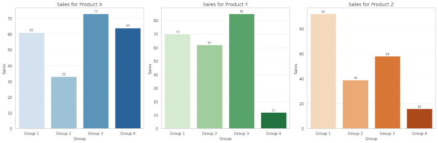
Multiple Bar Charts

def plot_multiple_bar_charts(data):
    """Create multiple bar charts in a single figure."""
    # Create a figure with subplots
    fig, axes = plt.subplots(1, 3, figsize=(18, 6))

    # Plot Sales by Group for each subplot (different products)
    for i, product in enumerate(['Product X', 'Product Y', 'Product Z']):
        product_data = data[data['Product'] == product]

        # Handle both old and new seaborn API
        # Use predefined color palettes instead of dynamic names
        palette_choices = ['Blues', 'Greens', 'Oranges']

        try:
            # New seaborn API (v0.12+)
            sns.barplot(x='Group', y='Sales', data=product_data, ax=axes[i],
                        palette=palette_choices[i], errorbar=None)
        except TypeError:
            # Old seaborn API
            sns.barplot(x='Group', y='Sales', data=product_data, ax=axes[i],
                        palette=palette_choices[i])

        axes[i].set_title(f'Sales for {product}', fontsize=14)
        axes[i].set_xlabel('Group', fontsize=12)
        axes[i].set_ylabel('Sales', fontsize=12)
        axes[i].grid(axis='y', alpha=0.3)

        # Add value labels
        for j, v in enumerate(product_data['Sales']):
            axes[i].text(j, v + 1, str(v), ha='center', fontsize=9)

    plt.tight_layout()
    plt.close()
    return fig
Explanation:
- Input Data:
- The function takes a DataFrame (
data) with columnsGroup,Product, andSales. - Each row represents the sales of a specific product within a group. For example:
Group Product Sales 0 Group 1 Product X 45 1 Group 1 Product Y 30 2 Group 1 Product Z 25 ...
- The function takes a DataFrame (
- Creating Subplots:
- The
plt.subplotsfunction is used to create a figure with three subplots arranged in a single row (1, 3). - The
figsize=(18, 6)parameter ensures that the figure is wide enough to accommodate all three charts without overlapping.
- The
- Iterating Over Products:
- A loop iterates over the list of products (
['Product X', 'Product Y', 'Product Z']). - For each product, the data is filtered to include only rows corresponding to that product. This filtered data is then used to create a bar chart.
- A loop iterates over the list of products (
- Using Palettes:
- The
palette_choiceslist defines a unique color palette for each product:'Blues'forProduct X'Greens'forProduct Y'Oranges'forProduct Z
- These palettes are predefined in Seaborn and provide a consistent and visually appealing color scheme.
- By assigning a different palette to each subplot, the charts are visually distinct, making it easier to compare products.
- The
- Bar Chart Creation:
- The
sns.barplotfunction is used to create the bar chart for each product. - The
xparameter specifies the categorical variable (Group), and theyparameter specifies the numerical variable (Sales). - The
paletteparameter is set to the corresponding palette frompalette_choices. - The
errorbar=Noneargument ensures compatibility with Seaborn v0.12+.
- The
- Customization:
- Each subplot is customized with a title (
Sales for {product}), x-axis label (Group), and y-axis label (Sales). - A grid is added along the y-axis using
axes[i].gridto improve readability.
- Each subplot is customized with a title (
- Adding Value Labels:
- The
plt.textfunction is used to add value labels on top of each bar. - The labels are positioned slightly above the bars (
v + 1) for better visibility.
- The
Leveraging Palettes:
The use of palettes in this example demonstrates how color schemes can enhance the readability and aesthetics of visualizations. By assigning a unique palette to each subplot:
- The charts are visually distinct, making it easier to compare data across products.
- The consistent use of color within each chart reinforces the grouping of bars by category (
Group).
Seaborn provides a wide range of predefined palettes (e.g., 'Blues', 'Greens', 'Oranges', 'Set2', 'tab10'), which can be used to create visually appealing and consistent charts. Additionally, custom palettes can be created using sns.color_palette for more specific color requirements.
Scatterplots
Scatterplots are a powerful way to visualize relationships between two numerical variables. They can also incorporate additional dimensions, such as categories or sizes, to provide deeper insights. In this section, we’ll explore basic scatterplots, scatterplots with categorical variables, and bubble charts. First let’s create some more sample data.
More Sample Data Generation
def create_more_sample_data():
    """Create sample data for various chart types"""
    # Create a DataFrame with multiple variables for different chart types
    np.random.seed(42)

    # For scatterplots
    n = 100
    x = np.random.normal(size=n)
    y = x + np.random.normal(size=n, scale=0.5)
    categories = np.random.choice(['A', 'B', 'C', 'D'], size=n)
    sizes = np.random.uniform(10, 200, size=n)

    scatter_df = pd.DataFrame({
        'x': x,
        'y': y,
        'category': categories,
        'size': sizes
    })

    # For boxplots
    box_data = pd.DataFrame({
        'group': np.repeat(['A', 'B', 'C', 'D', 'E'], 30),
        'value': np.concatenate([
            np.random.normal(0, 1, 30),
            np.random.normal(2, 1.5, 30),
            np.random.normal(4, 1, 30),
            np.random.normal(1.5, 2, 30),
            np.random.normal(3, 1, 30)
        ]),
        'subgroup': np.tile(np.repeat(['X', 'Y', 'Z'], 10), 5)
    })

    # For candlestick data
    dates = pd.date_range(start='2023-01-01', periods=30, freq='B')

    candlestick_data = pd.DataFrame({
        'date': dates,
        'open': np.random.uniform(100, 150, size=30),
        'close': np.random.uniform(100, 150, size=30),
        'high': np.zeros(30),
        'low': np.zeros(30)
    })

    # Ensure high is always the highest and low is always the lowest
    for i in range(len(candlestick_data)):
        op = candlestick_data.loc[i, 'open']
        cl = candlestick_data.loc[i, 'close']
        candlestick_data.loc[i, 'high'] = max(op, cl) + np.random.uniform(1, 10)
        candlestick_data.loc[i, 'low'] = min(op, cl) - np.random.uniform(1, 10)

    return scatter_df, box_data, candlestick_data
Explanation:
- Setting the Random Seed:
- The
np.random.seed(42)function ensures reproducibility by initializing the random number generator with a fixed seed. This guarantees that the generated data will be the same every time the function is run.
- The
Scatterplot Data:
- Generating Numerical Variables (
xandy):xis generated usingnp.random.normal(size=n), which createsnrandom values from a standard normal distribution (mean = 0, standard deviation = 1).yis generated as a linear relationship withx(y = x + noise), where the noise is drawn from a normal distribution with a standard deviation of 0.5.
- Generating Categorical Variables (
category):categoriesis created usingnp.random.choice(['A', 'B', 'C', 'D'], size=n), which randomly assigns one of four categories (A,B,C,D) to each data point.
- Generating Sizes (
size):sizesis created usingnp.random.uniform(10, 200, size=n), which generates random values between 10 and 200 to represent the size of each data point.
- Creating the Scatterplot DataFrame:
- The
scatter_dfDataFrame combines these variables into a structured format with columnsx,y,category, andsize. - This dataset is ideal for creating scatterplots, bubble charts, or scatterplot matrices.
- The
Boxplot Data:
- Generating Groups (
group):groupis created usingnp.repeat(['A', 'B', 'C', 'D', 'E'], 30), which repeats each group label (A,B,C,D,E) 30 times.
- Generating Values (
value):valueis created by concatenating random samples from different normal distributions:- Group
A: Mean = 0, Standard Deviation = 1 - Group
B: Mean = 2, Standard Deviation = 1.5 - Group
C: Mean = 4, Standard Deviation = 1 - Group
D: Mean = 1.5, Standard Deviation = 2 - Group
E: Mean = 3, Standard Deviation = 1
- Group
- Generating Subgroups (
subgroup):subgroupis created usingnp.tile(np.repeat(['X', 'Y', 'Z'], 10), 5), which assigns one of three subgroups (X,Y,Z) to each data point within a group.
- Creating the Boxplot DataFrame:
- The
box_dataDataFrame combines these variables into a structured format with columnsgroup,value, andsubgroup. - This dataset is ideal for creating boxplots, violin plots, or grouped boxplots.
- The
Candlestick Data:
- Generating Dates (
date):datesis created usingpd.date_range(start='2023-01-01', periods=30, freq='B'), which generates 30 business days starting from January 1, 2023.
- Generating Open and Close Prices (
openandclose):openandcloseare created usingnp.random.uniform(100, 150, size=30), which generates random stock prices between 100 and 150.
- Initializing High and Low Prices (
highandlow):highandloware initialized as zeros.
- Calculating High and Low Prices:
- A loop iterates through each row of the
candlestick_dataDataFrame. - For each row, the
highprice is set to the maximum ofopenandcloseplus a random value between 1 and 10. - Similarly, the
lowprice is set to the minimum ofopenandcloseminus a random value between 1 and 10. - This ensures that the
highprice is always greater than or equal to bothopenandclose, and thelowprice is always less than or equal to both.
- A loop iterates through each row of the
- Creating the Candlestick DataFrame:
- The
candlestick_dataDataFrame combines these variables into a structured format with columnsdate,open,close,high, andlow. - This dataset is ideal for creating candlestick charts, commonly used in financial analysis.
- The
Code Example: Basic Scatterplot

def plot_basic_scatterplot(data):
    """Create a basic scatterplot."""
    fig, ax = plt.subplots(figsize=(10, 6))

    # Create the scatterplot
    sns.scatterplot(x='x', y='y', data=data, ax=ax, color='blue', alpha=0.7)

    plt.title('Basic Scatterplot', fontsize=16)
    plt.xlabel('X-axis', fontsize=12)
    plt.ylabel('Y-axis', fontsize=12)
    plt.grid(alpha=0.3)

    plt.tight_layout()
    plt.close()
    return fig
Explanation:
- Input Data:
- The function takes a DataFrame (
data) with two columns:xandy. - Each row represents a data point with its
xandycoordinates.
- The function takes a DataFrame (
- Scatterplot Creation:
- The
sns.scatterplotfunction is used to create the scatterplot. - The
xparameter specifies the variable for the x-axis, and theyparameter specifies the variable for the y-axis. - The
colorparameter is set to'blue'to apply a uniform color to all points. - The
alphaparameter is set to0.7to make the points slightly transparent, reducing overlap.
- The
Code Example: Scatterplot with Categorical Variables

def plot_categorical_scatterplot(data):
    """Create a scatterplot with categorical variables."""
    fig, ax = plt.subplots(figsize=(10, 6))

    # Create the scatterplot
    sns.scatterplot(x='x', y='y', hue='category', data=data, ax=ax, palette='Set2', alpha=0.8)

    plt.title('Scatterplot with Categorical Variables', fontsize=16)
    plt.xlabel('X-axis', fontsize=12)
    plt.ylabel('Y-axis', fontsize=12)
    plt.legend(title='Category', loc='upper right')
    plt.grid(alpha=0.3)

    plt.tight_layout()
    plt.close()
    return fig
Explanation:
- Input Data:
- The function takes a DataFrame (
data) with three columns:x,y, andcategory. - Each row represents a data point with its
xandycoordinates and a categorical label (category).
- The function takes a DataFrame (
- Scatterplot Creation:
- The
sns.scatterplotfunction is used to create the scatterplot. - The
hueparameter is set tocategory, which assigns a unique color to each category. - The
paletteparameter is set to'Set2'to apply a visually distinct color scheme. - The
alphaparameter is set to0.8to make the points slightly transparent.
- The
- Customization:
- A title and axis labels are added for clarity.
- A legend is added using
plt.legend, with the title set toCategoryand positioned in the upper-right corner. - A grid is added for better readability.
Code Example: Bubble Chart

def plot_bubble_chart(data):
    """Create a bubble chart."""
    fig, ax = plt.subplots(figsize=(10, 6))

    # Create the bubble chart
    sns.scatterplot(x='x', y='y', size='size', hue='category', data=data, ax=ax,
                    sizes=(20, 200), palette='coolwarm', alpha=0.8)

    plt.title('Bubble Chart', fontsize=16)
    plt.xlabel('X-axis', fontsize=12)
    plt.ylabel('Y-axis', fontsize=12)
    plt.legend(title='Category', loc='upper right', bbox_to_anchor=(1.2, 1))
    plt.grid(alpha=0.3)

    plt.tight_layout()
    plt.close()
    return fig
Explanation:
- Input Data:
- The function takes a DataFrame (
data) with four columns:x,y,size, andcategory. - Each row represents a data point with its
xandycoordinates, a size value (size), and a categorical label (category).
- The function takes a DataFrame (
- Bubble Chart Creation:
- The
sns.scatterplotfunction is used to create the bubble chart. - The
sizeparameter is set tosize, which determines the size of each bubble. - The
hueparameter is set tocategory, which assigns a unique color to each category. - The
sizesparameter is set to(20, 200)to define the range of bubble sizes. - The
paletteparameter is set to'coolwarm'to apply a gradient color scheme. - The
alphaparameter is set to0.8to make the bubbles slightly transparent.
- The
- Customization:
- A title and axis labels are added for clarity.
- A legend is added using
plt.legend, with the title set toCategoryand positioned outside the chart (bbox_to_anchor=(1.2, 1)). - A grid is added for better readability.
- Layout Adjustment:
- The
plt.tight_layout()function ensures that the chart elements do not overlap.
- The
Boxplots
Boxplots are a great way to visualize the distribution of data and identify outliers. They summarize key statistical properties, such as the median, quartiles, and potential outliers. In this section, we’ll explore basic boxplots, grouped horizontal boxplots, and violin boxplots with boxplot overlays.

Code Example: Horizontal Boxplot
def plot_horizontal_boxplot(data):
    """Create a horizontal boxplot"""
    fig, ax = plt.subplots(figsize=(12, 6))
    sns.boxplot(x='value', y='group', data=data, orient='h')
    plt.title('Horizontal Boxplot')
    plt.tight_layout()
    plt.close()
    return fig
Explanation:
- Input Data:
- The function takes a DataFrame (
data) with columnsgroupandvalue. - Each row represents a data point, with
groupindicating the category andvaluerepresenting the numerical variable.
- The function takes a DataFrame (
- Boxplot Creation:
- The
sns.boxplotfunction is used to create the horizontal boxplot. - The
xparameter specifies the numerical variable (value), and theyparameter specifies the categorical variable (group). - The
orient='h'parameter ensures that the boxplot is displayed horizontally. - The
paletteparameter is set to'Set3'to apply a visually distinct color scheme.
- The
- Customization:
- A title and axis labels are added for clarity using
plt.title,plt.xlabel, andplt.ylabel.
- A title and axis labels are added for clarity using
Code Example: Grouped Horizontal Boxplot

def plot_grouped_horizontal_boxplot(data):
    """Create a grouped horizontal boxplot."""
    fig, ax = plt.subplots(figsize=(10, 6))

    # Create the horizontal boxplot
    sns.boxplot(y='group', x='value', hue='subgroup', data=data, ax=ax, palette='Set2')

    plt.title('Grouped Horizontal Boxplot', fontsize=16)
    plt.xlabel('Value', fontsize=12)
    plt.ylabel('Group', fontsize=12)
    plt.legend(title='Subgroup', loc='upper right')
    plt.grid(axis='x', alpha=0.3)

    plt.tight_layout()
    plt.close()
    return fig
Explanation:
- Input Data:
- The function takes a DataFrame (
data) with columnsgroup,value, andsubgroup. - Each row represents a data point, with
groupindicating the category,valuerepresenting the numerical variable, andsubgroupproviding an additional categorical dimension.
- The function takes a DataFrame (
- Boxplot Creation:
- The
sns.boxplotfunction is used to create the horizontal boxplot. - The
yparameter specifies the categorical variable (group), and thexparameter specifies the numerical variable (value). - The
hueparameter is set tosubgroup, which groups the boxplots by thesubgroupvariable. - The
paletteparameter is set to'Set2'to apply a visually distinct color scheme.
- The
- Customization:
- A title and axis labels are added for clarity.
- A legend is added using
plt.legend, with the title set toSubgroupand positioned in the upper-right corner.
Code Example: Horizontal Violin Boxplot

def plot_horizontal_violin_boxplot(data):
    """Create a horizontal violin plot with boxplot inside."""
    fig, ax = plt.subplots(figsize=(12, 8))

    # Create the horizontal violin plot with boxplot inside
    sns.violinplot(x='value', y='group', data=data, inner='box', orient='h', palette='muted')

    plt.title('Horizontal Violin Plot with Boxplot', fontsize=16)
    plt.xlabel('Value', fontsize=12)
    plt.ylabel('Group', fontsize=12)
    plt.grid(axis='x', alpha=0.3)

    plt.tight_layout()
    plt.close()
    return fig
Explanation:
- Input Data:
- The function takes a DataFrame (
data) with columnsgroupandvalue. - Each row represents a data point, with
groupindicating the category andvaluerepresenting the numerical variable.
- The function takes a DataFrame (
- Violin Plot Creation:
- The
sns.violinplotfunction is used to create the horizontal violin plot. - The
xparameter specifies the numerical variable (value), and theyparameter specifies the categorical variable (group). - The
orient='h'parameter ensures that the violin plot is displayed horizontally. - The
inner='box'parameter overlays a boxplot inside the violin plot, providing additional statistical information such as the median and quartiles. - The
palette='muted'parameter applies a soft color scheme to the plot.
- The
- Customization:
- A title and axis labels are added for clarity using
plt.title,plt.xlabel, andplt.ylabel.
- A title and axis labels are added for clarity using
Candlestick Charts
Candlestick charts are widely used in financial analysis to visualize price movements over time. They provide a compact representation of open, high, low, and close prices for a given time period, making it easy to identify trends and patterns. In this section, we’ll create a candlestick chart using Matplotlib.

Code Example: Candlestick Chart
def plot_candlestick_chart(data):
    """Create a candlestick chart using matplotlib"""
    fig, ax = plt.subplots(figsize=(14, 8))

    # Format the x-axis to show dates nicely
    ax.xaxis.set_major_formatter(plt.matplotlib.dates.DateFormatter('%Y-%m-%d'))
    plt.xticks(rotation=45)

    # Width of the candlesticks
    width = 0.6
    width2 = 0.1

    # Define up and down colors
    up_color = 'green'
    down_color = 'red'

    # Plot the candlesticks
    for i, row in data.iterrows():
        # Use the right color depending on if the stock closed higher or lower
        color = up_color if row['close'] >= row['open'] else down_color

        # Plot the price range line (high to low)
        ax.plot([row['date'], row['date']], [row['low'], row['high']],
                color=color, linewidth=1)

        # Plot the open-close body
        ax.bar(row['date'], height=abs(row['close'] - row['open']),
               bottom=min(row['open'], row['close']), width=width,
               color=color, alpha=0.7)

    ax.set_title('Candlestick Chart')
    ax.set_xlabel('Date')
    ax.set_ylabel('Price')
    ax.grid(True, alpha=0.3)
    plt.tight_layout()
    plt.close()
    return fig
Explanation:
- Input Data:
- The function takes a DataFrame (
data) with columnsdate,open,close,high, andlow. - Each row represents the price data for a specific date.
date open close high low 0 2023-01-01 120.5 125.3 130.2 115.4 1 2023-01-02 126.0 122.8 128.5 120.0 ... - The function takes a DataFrame (
- Formatting the X-Axis:
- The x-axis is formatted to display dates in a readable format using
ax.xaxis.set_major_formatter(plt.matplotlib.dates.DateFormatter('%Y-%m-%d')). - The
plt.xticks(rotation=45)function rotates the date labels by 45 degrees for better readability.
- The x-axis is formatted to display dates in a readable format using
- Defining Candlestick Widths:
- The
widthparameter specifies the width of the candlestick body (open-close rectangle). - The
width2parameter can be used for additional customization, such as thinner lines for high-low ranges.
- The
- Defining Colors:
up_coloris set to'green'for days when the stock closes higher than it opens (gain).down_coloris set to'red'for days when the stock closes lower than it opens (loss).
- Plotting the Candlesticks:
- A loop iterates over each row of the DataFrame using
data.iterrows(). - For each row:
- The
coloris determined based on whether thecloseprice is greater than or equal to theopenprice (up_color) or less than theopenprice (down_color). - The high-low line is plotted using
ax.plot, representing the range of prices for the day. - The open-close rectangle is plotted using
ax.bar, where:- The
heightis the absolute difference betweencloseandopen. - The
bottomis the smaller of theopenandcloseprices. - The
widthis set towidth, and thecoloris set to the determinedcolor.
- The
- The
- A loop iterates over each row of the DataFrame using
Interactive Chart Selector with IpyWidgets
Interactivity is a powerful way to enhance data visualization, allowing users to explore different aspects of the data dynamically. Ipywidgets is a Python library that integrates seamlessly with Jupyter Notebooks to create interactive widgets, such as dropdowns, sliders, and buttons. By combining Ipywidgets with Seaborn and Matplotlib, we can create an interactive chart selector that enables users to switch between different chart types effortlessly. This approach is particularly useful for exploring multiple visualizations in a single notebook without cluttering the interface.
In this section, we’ll use a dropdown widget to let users select a chart type, and the corresponding chart will be displayed dynamically. This makes it easy to compare different visualizations and understand their use cases.

Code Example: Interactive Chart Selector
# Create sample data for bar charts
simple_data, complex_data, percentage_data = create_sample_data()
# Create the rest of the sample data
scatter_data, box_data, candlestick_data = create_more_sample_data()

# Define a function to display the selected chart
def display_chart(chart_type):
    plt.close('all')  # Close any existing plots
    clear_output(wait=True)

    if chart_type == 'Math Functions':
        fig = plot_math_functions()
    elif chart_type == 'Random Walk':
        fig = plot_random_walk()
    elif chart_type == 'Simple Bar Chart':
        fig = plot_simple_bar_chart(simple_data)
    elif chart_type == 'Grouped Bar Chart':
        fig = plot_grouped_bar_chart(complex_data)
    elif chart_type == 'Stacked Bar Chart':
        fig = plot_stacked_bar_chart(complex_data)
    elif chart_type == 'Percentage Stacked Bar':
        fig = plot_percentage_stacked_bar(percentage_data)
    elif chart_type == 'Multiple Bar Charts':
        fig = plot_multiple_bar_charts(complex_data)
    elif chart_type == 'Basic Scatterplot':
        fig = plot_basic_scatterplot(scatter_data)
    elif chart_type == 'Categorical Scatterplot':
        fig = plot_categorical_scatterplot(scatter_data)
    elif chart_type == 'Bubble Chart':
        fig = plot_bubble_chart(scatter_data)
    elif chart_type == 'Horizontal Boxplot':
        fig = plot_horizontal_boxplot(box_data)
    elif chart_type == 'Grouped Horizontal Boxplot':
        fig = plot_grouped_horizontal_boxplot(box_data)
    elif chart_type == 'Horizontal Violin Boxplot':
        fig = plot_horizontal_violin_boxplot(box_data)
    elif chart_type == 'Candlestick Chart':
        fig = plot_candlestick_chart(candlestick_data)

    return fig

# Create a dropdown widget
chart_dropdown = widgets.Dropdown(
    options=[
        'Math Functions',
        'Random Walk',
        'Simple Bar Chart',
        'Grouped Bar Chart',
        'Stacked Bar Chart',
        'Percentage Stacked Bar',
        'Multiple Bar Charts',
        'Basic Scatterplot',
        'Categorical Scatterplot',
        'Bubble Chart',
        'Horizontal Boxplot',
        'Grouped Horizontal Boxplot',
        'Horizontal Violin Boxplot',
        'Candlestick Chart'
    ],
    value='Math Functions',
    description='Chart Type:',
    style={'description_width': 'initial'},
    layout=widgets.Layout(width='50%')
)

# Create an output widget to display the chart
output = widgets.Output()

# Define the callback function for the dropdown
def on_change(change):
    with output:
        display(display_chart(change.new))

# Register the callback
chart_dropdown.observe(on_change, names='value')

# Display the initial chart
with output:
    display(display_chart(chart_dropdown.value))

# Display the widget and output
display(widgets.VBox([chart_dropdown, output]))
Explanation:
- Creating Sample Data:
- The
create_sample_data()andcreate_more_sample_data()functions are used to generate the datasets required for the charts. These datasets include data for bar charts, scatterplots, boxplots, and candlestick charts.
- The
- Defining the
display_chartFunction:- This function takes a
chart_typeas input and dynamically generates the corresponding chart. - It uses a series of
if-elifstatements to call the appropriate plotting function based on the selected chart type. - The
plt.close('all')function ensures that any previously displayed plots are closed to avoid clutter. - The
clear_output(wait=True)function clears the output area before displaying the new chart.
- This function takes a
- Creating the Dropdown Widget:
- The
widgets.Dropdownwidget is used to create a dropdown menu with a list of chart types as options. - The
valueparameter sets the default selected chart type ('Math Functions'). - The
descriptionparameter adds a label ('Chart Type:') to the dropdown. - The
layoutparameter is used to control the width of the dropdown.
- The
- Creating the Output Widget:
- The
widgets.Outputwidget is used to display the selected chart dynamically. - This widget acts as a container for the chart output.
- The
- Defining the Callback Function:
- The
on_changefunction is triggered whenever the value of the dropdown changes. - It uses the
outputwidget to display the chart corresponding to the newly selected chart type by calling thedisplay_chartfunction.
- The
- Registering the Callback:
- The
chart_dropdown.observemethod is used to register theon_changefunction as a callback for thevalueproperty of the dropdown. - This ensures that the chart updates dynamically whenever the user selects a new chart type.
- The
- Displaying the Initial Chart:
- The
with outputblock is used to display the default chart ('Math Functions') when the notebook is first loaded.
- The
- Displaying the Widgets:
- The
widgets.VBoxwidget is used to arrange the dropdown and output widgets vertically. - The
displayfunction is used to render the widgets in the notebook.
- The
Conclusion
Data visualization is an essential tool for understanding and communicating insights from data. In this blog, we explored the versatility of Seaborn, a powerful Python library for creating a wide range of charts with minimal effort. From basic scatterplots and bar charts to advanced candlestick charts and interactive visualizations with Ipywidgets, we demonstrated how Seaborn can be used to create visually appealing and informative graphics.
By integrating Seaborn with Matplotlib, Pandas, and Ipywidgets, we showcased how to enhance the interactivity and usability of visualizations in Jupyter Notebooks. Whether you’re analyzing trends, comparing groups, or identifying patterns, Seaborn provides the tools to make your data come to life.
We encourage you to experiment with the examples provided in this blog and adapt them to your own datasets. Visualization is not just about presenting data—it’s about telling a story. With Seaborn, you have the flexibility and power to craft compelling narratives that resonate with your audience.
For the full code and datasets used in this blog, feel free to explore the accompanying repository.